Case study
The rise of AI health care application
Redesigned a physical health checkup report into a digital format to improve patient access to health reports while ensuring smooth data flow between healthcare institutions.

Objectives & Goals
Before designing any screen

I mapped how patients move through the real world:
Mapping the Patient Journey
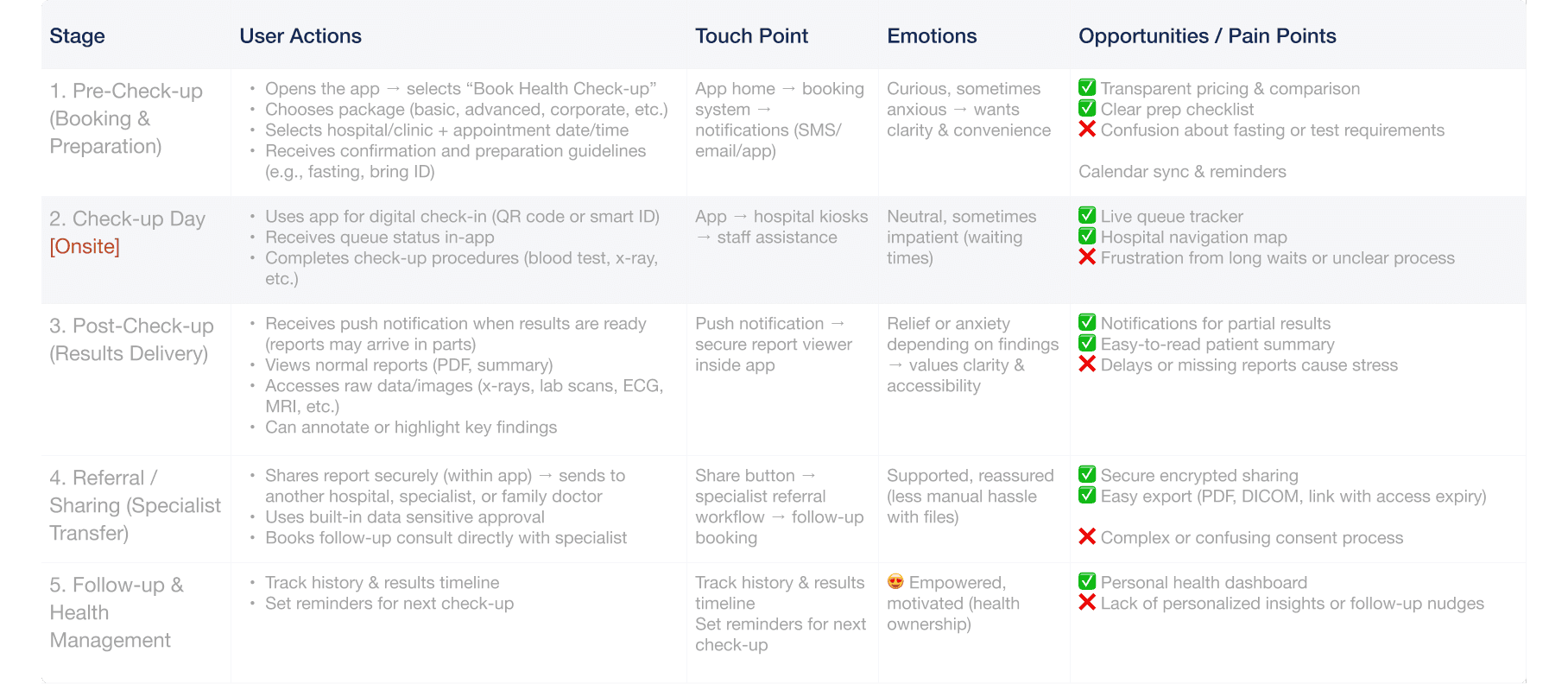
The Task Mapping table serves as the operational backbone of the system, translating patient actions and emotional states into actionable design opportunities across five key stages ,from pre-checkup booking to long-term health management.
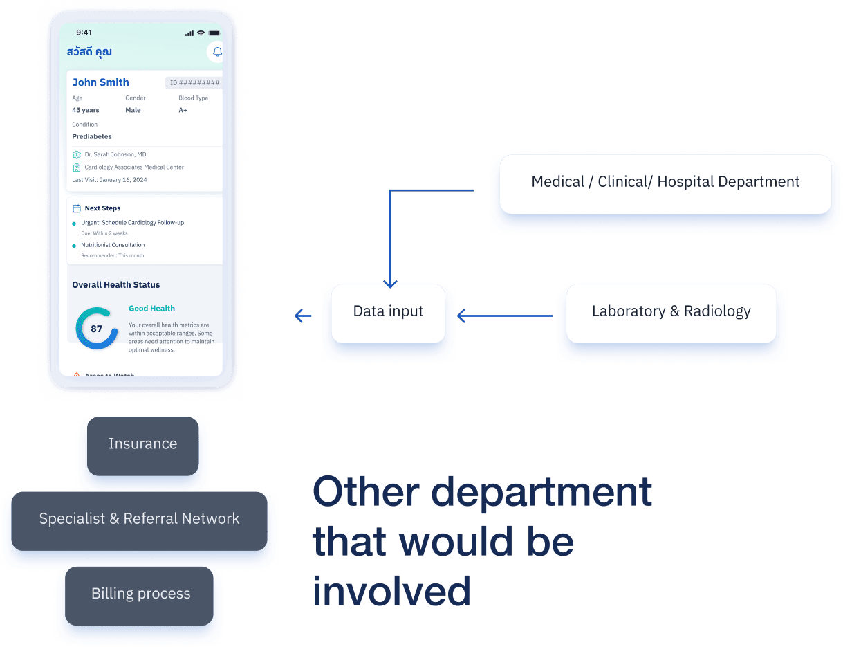
Each stage is mapped not just to user behavior, but to specific touchpoints within the hospital ecosystem: Medical/Clinical Departments provide data input, Laboratory & Radiology generate reports, Insurance handles billing, and Specialist Networks facilitate referrals.
This alignment ensures that every pain point (e.g., “confusion about fasting requirements” or “frustration from long waits”) is addressed by the right department at the right time, turning fragmented processes into a unified, patient-centered experience.
Functional research Insight
To design an effective pet hotel booking experience in Bangkok a dense, relationship-driven urban environment we grounded our approach in competitive analysis and user journey mapping. We identified that pet parents prioritise trust, convenience, and emotional reassurance over price alone: word-of-mouth, proximity, and pickup/delivery options influence decisions
We listened closely for recurring pain points, emotional triggers, and unmet needs around booking pet hotels. Key quotes revealed that users care deeply about trust , convenience , and peace of mind .
These insights were translated into clear design goals: simplify documentation, surface location-based filters, and integrate social proof through verified stories and photos.
From pet hotel owners, we learned they prfioritize proof of vaccination documents and are especially careful about hygiene across pets from different families. Some facilities avoid furniture in rooms or only provide easy-to-clean toys to minimise cross-contamination.
Task Mapping
Translating User Behavior into Design Opportunities
Process
How User Needs Shape Healthcare Booking & Report Flows
Scenario-Based Flows
From “report is ready” to “I know what to do next”
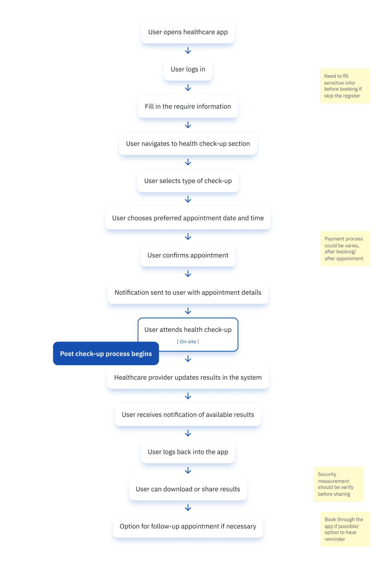
The two core scenarios : Booking a Health Check-up and Receiving the Report are structured around functional research insights: users need clarity, security, and control at every step.
In Scenario 1, we mapped the journey from app launch to on-site check-in, embedding reminders and validation points to reduce friction and prevent errors.
In Scenario 2, we prioritized transparency, ensuring users receive timely notifications, can access results with one tap, and securely share data with doctors or insurance.
Every node in these flows reflects a user need: simplify documentation, verify security before sharing, and offer follow-up options without forcing re-navigation.
This isn’t just process mapping, it’s designing systems that anticipate patient behavior, turning clinical complexity into intuitive action
Each yellow note represents a pain point addressed by the flow
Wireframe
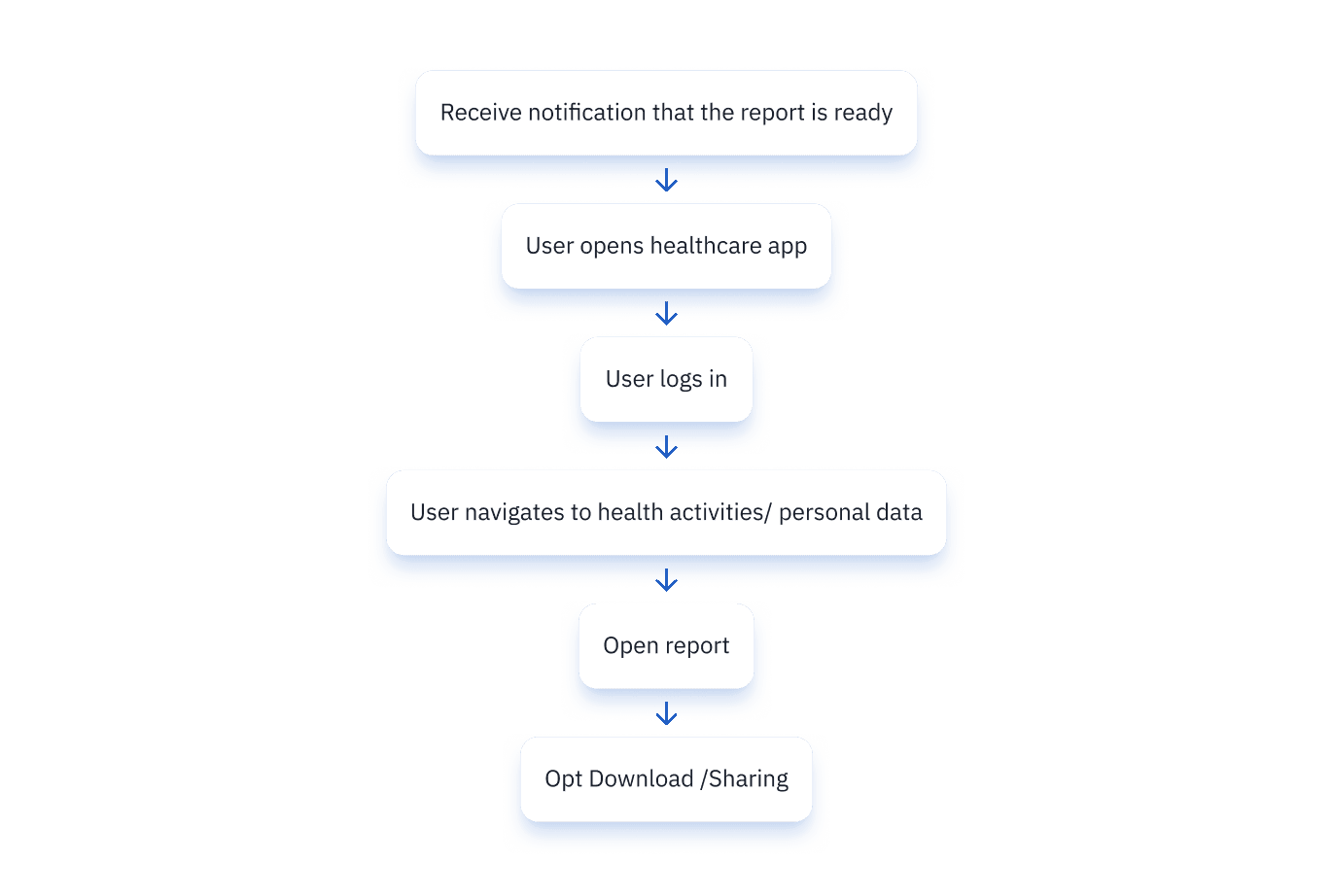
This flow illustrates how users transition from receiving a health report notification to accessing and sharing their data ,designed for clarity and control. It begins with a push notification,triggering immediate action.
The user then logs in via secure methods : reducing friction while maintaining security. Once authenticated, they land on the homepage, where “Health Activity” or “Personal Information” serves as the gateway to the full report.
From there, they can view detailed results, download PDFs, or share data via email.
Every step was engineered to eliminate ambiguity: no hidden menus, no redundant clicks.
The goal? Make critical health information feel accessible, not intimidating — because in healthcare, the simplest flows often carry the most weight
Visual process
Mapping UI Hierarchy Based on Research & Real-World Flow

The UI bends to real-world constraints, not the other way around.
This final screen is where data becomes actionable. The dashboard greets the user with personalized context and immediately surfaces critical insights: his condition, care team, and next steps.
A visual health score gives instant reassurance, while “Areas to Watch” highlights elevated cholesterol and glucose , not as warnings, but as opportunities for intervention.
Users can drill into detailed metrics, lab results, physician notes, or imaging reports with one tap.
The “Export & Share Health Data” section ensures seamless collaboration: download full reports (PDF/Excel) or share directly with doctors.
It’s a personalized health command center, engineered to reduce anxiety by turning complex medical data into clear, guided actions.